Calorie Tracking App
This project explores a concept redesign of an AI-assisted calorie
tracking experience, rethinking common patterns found in existing
tracking apps to reduce friction and improve daily usability.
Calorie Tracking App
This project explores a concept redesign of an AI-assisted calorie
tracking experience, rethinking common patterns found in existing
tracking apps to reduce friction and improve daily usability.


Role & Scope
Role & Scope
Concept redesign · UX/UI + Visual Design · Solo project
Deliverables: User flow, wireframes, design rationale, final UI
Context & Problem
Context & Problem
Many calorie tracking apps prioritize accuracy and detailed nutritional breakdowns. However, in everyday use, users often abandon these apps due to high logging friction and unclear feedback.
Based on conversations with a representative user and common pain points across existing tracking apps, three problems emerged:
Logging meals is time-consuming and repetitive.
Logging meals is time-consuming
and repetitive.
Daily calorie data is difficult to interpret and does not clearly guide action.
Daily calorie data is difficult to interpret
and does not clearly guide action.
AI food recognition is often inaccurate, increasing correction fatigue.
AI food recognition is often inaccurate,
increasing correction fatigue.
Target User
Target User
Busy young adults who want to manage calorie intake but struggle with consistency due to high logging friction and unclear feedback.
Primary Pain Points
-Logging feels tedious and interrupts daily routines
-Numbers alone do not explain “how today is going”
Primary Need
-Fast logging with clear, non-judgmental feedback
Design Goals
Reduce meal logging to under 30 seconds per entry.
Prioritize clarity over precision in daily feedback.
Encourage consistency through lightweight, non-guilty design.
Design Goals
Key Design Decisions
Target User
Key Design Decisions
The app centers around a Today-first dashboard, allowing users to immediately understand their current intake status.
A streamlined Quick Log flow minimizes steps and avoids forcing users to restart when AI suggestions are inaccurate.
Detailed nutritional data, such as macronutrients, is intentionally deferred to the Summary view to reduce cognitive load during logging.
Feedback language avoids guilt or judgment, reinforcing progress rather than perfection.
Busy young adults who want to manage calorie intake but struggle with consistency due to high logging friction and unclear feedback.
Primary Pain Points
-Logging feels tedious and interrupts daily routines
-Numbers alone do not explain “how today is going”
Primary Need
-Fast logging with clear, non-judgmental feedback
The app centers around a Today-first dashboard, allowing users to immediately understand their current intake status.
A streamlined Quick Log flow minimizes steps and avoids forcing users to restart when AI suggestions are inaccurate.
Detailed nutritional data, such as macronutrients, is intentionally deferred to the Summary view to reduce cognitive load during logging.
Feedback language avoids guilt or judgment, reinforcing progress rather than perfection.
Design Goals
Reduce meal logging to under 30 seconds per entry.
Prioritize clarity over precision in daily feedback.
Encourage consistency through lightweight, non-guilty design.
Key Design Decisions
The app centers around a Today-first dashboard, allowing users to immediately understand their current intake status.
A streamlined Quick Log flow minimizes steps and avoids forcing users to restart when AI suggestions are inaccurate.
Detailed nutritional data, such as macronutrients, is intentionally deferred to the Summary view to reduce cognitive load during logging.
Feedback language avoids guilt or judgment, reinforcing progress rather than perfection.
Main User Flow
Main User Flow
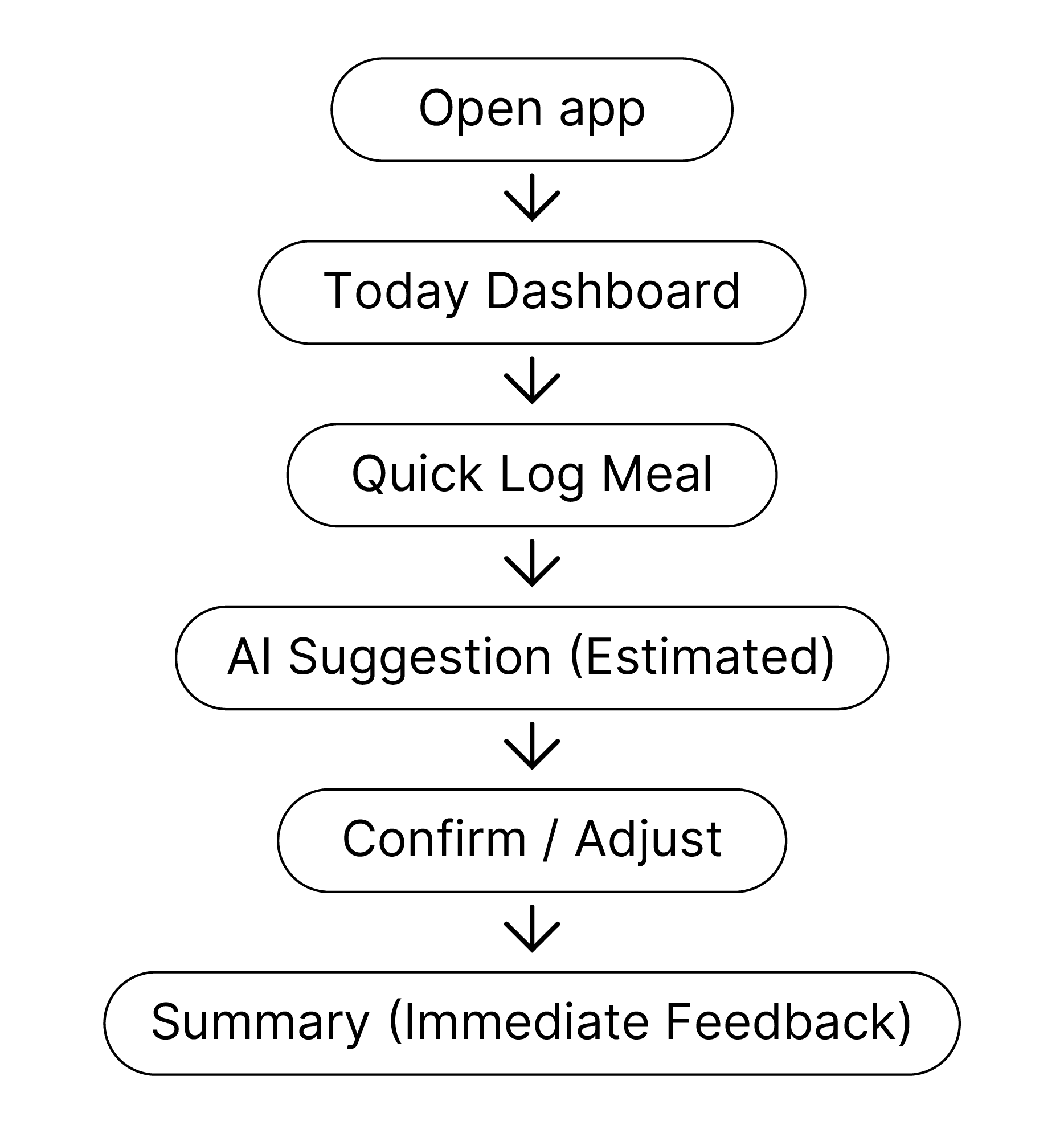
User opens the app to quickly check today’s intake status.
User lands on the Today Dashboard to immediately
understand their current intake status.
User taps “Quick Log” to add a meal with minimal effort.
AI suggests an estimated match.
User confirms or adjusts in one step.
The app shows an immediate Today Summary to reinforce progress.
Wireframes to Design
Low-fidelity wireframes were used to validate information hierarchy, interaction flow, and cognitive load before moving into visual design.
Key screens include the Today Dashboard, Quick Log, and Summary, forming a complete and focused core experience.
Low-fidelity wireframes were used to validate information hierarchy, interaction flow, and cognitive load before moving into visual design.
Key screens include the Today Dashboard, Quick Log, and Summary, forming a complete and focused core experience.

Final UI Design
Final UI Design
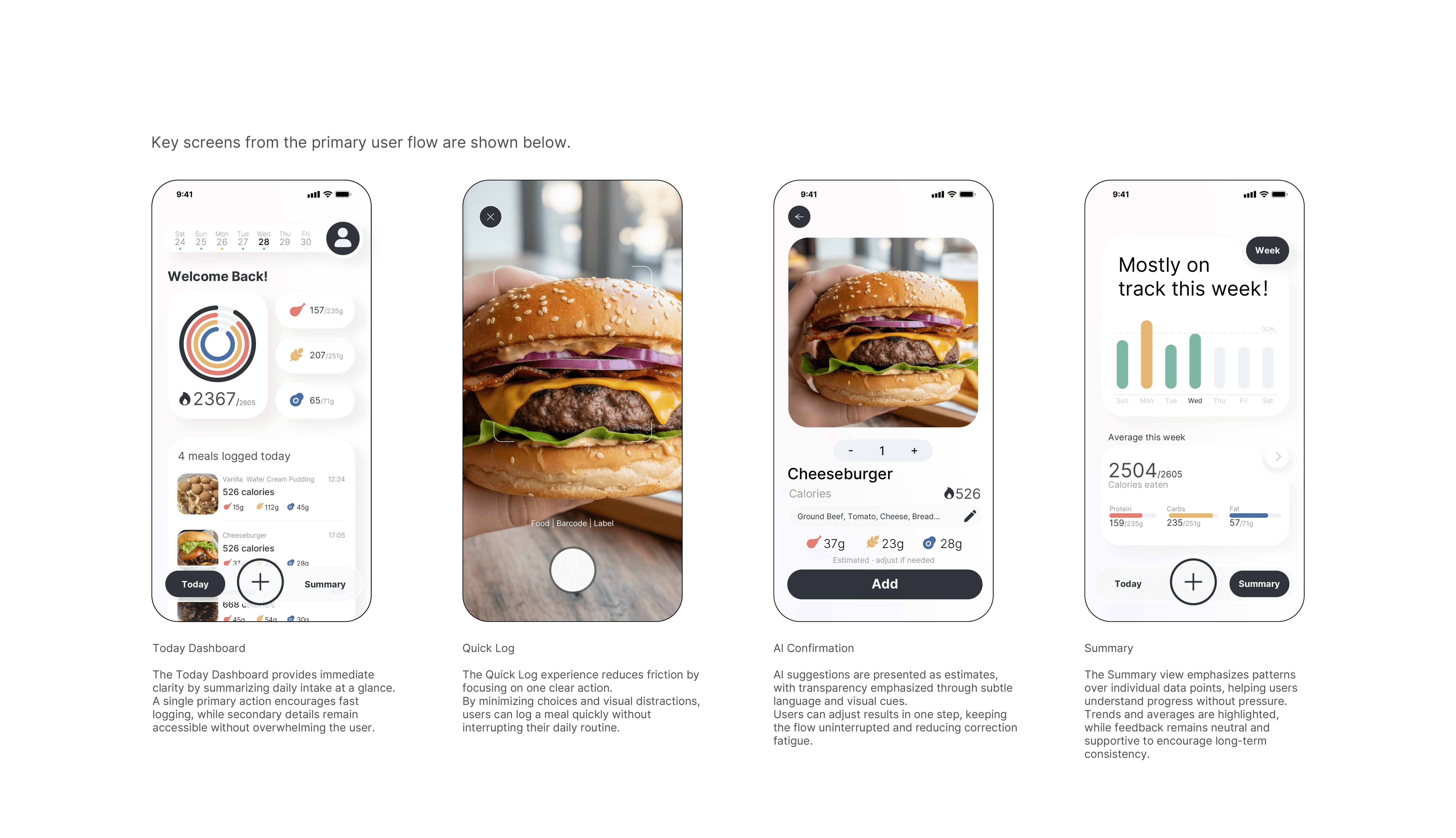
The final UI design focuses on calm clarity and low-pressure interaction, translating the earlier UX decisions into a supportive visual experience.
Instead of focusing on precision or performance, the interface prioritizes readability, emotional comfort, and consistency.
The visual system uses muted colors, generous spacing, and restrained hierarchy to reduce cognitive load and avoid judgmental cues.
Key actions are clearly defined, while secondary information is intentionally softened.